Friday, 6 May 2011
Wednesday, 4 May 2011
Tuesday, 29 March 2011
Monday, 14 March 2011
Name & font results
I printed off the examples of my Fonts and possible names, and asked a focus group which they prefered.
From my results i can see which were the most popular.
The result showed that the most popular name was
'THEBRONX'
The most popular font was the 4th font :
From my results i can see which were the most popular.
The result showed that the most popular name was
'THEBRONX'
The most popular font was the 4th font :
Sunday, 13 March 2011
Thursday, 10 March 2011
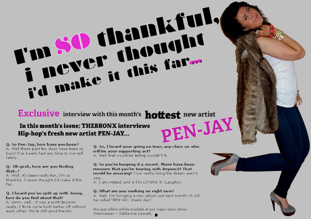
My Music Magazine Mock Up

To create my magazine i had to;
- I had to find a magazine i wanted to copy and re-create.
- I then used http://www.dafont.com/ to find a font type that best fitted the origional font used on the origional magazine cover.
- Then i found a colour that was most like the origional colour of the background and then set it as my background.
- I had to then add the star shapes to the cover.
- The photo was hard to take because of the outfit i had to choose, i managed to get a close as the origional outfit as possible without it being too revealing, i also had to find an old film camera for the model to hold over her shoulder, and to also get the body language and structer right to match the origional cover.
- The hardest part was re-creating the masthead, because i had to add the arrow onto the top of the U.
- At the end of re-creating the magazine, the last thing i had to do was to possition the text perfectly, as it was on the origional magazine with Ciara on it.
Strengths
- The font is almost exactly the same as the origional font.
- The body language and pose is the same as the origional image.
- The positioning of the text is the same as the positioning on the origional image.
Weaknesses
- I think the editing on the main image could of been done better, and more carefully.
- The colour of the background needed to be a mixture of white and pink in some areas however i couldn't create that.
- I didn't know how to create the flash coming off the film camera, i think that would of made the magazine better.
This is the origional cover.
Ciara - RapUp magazine.
Wednesday, 2 March 2011
Thursday, 20 January 2011
Saturday, 15 January 2011
3 College Magazine Covers
Strengths:
Weaknesses:
Strengths:
Strengths:
Weaknesses:
- The colour scheme fits in with the 'seasonal theme' e.g. pink connotes summer and freshness etc...
- The font is clear and easy to read.
- The photo fits with the genre of the magazine (college/school).
- The coverlines are good, and so are the insentives.
Weaknesses:
- The photo isn't as good qualilty as it could be.
- There could probably be more images on the cover.
- There should be more colour on the cover, to make it look brighter and attract more people's attention.
- There could be more info/ cover lines on the page.
Strengths:
- Again the colours link with the 'seasonal theme'.
- There are good insentives on there.
- There are some rhetorical questions on there, to engage the reader.
- There are coverlines about fitness, and healthiness - to encourage people who read it to be more healthy.
- There could probably be more cover lines and info on the page.
- There needs to be more images, linked to pages within the magazine.
- The main image isn't in the centre of the frame, and isn't using 'direct mode of address' which would have been more effective.
- The front cover isn't 'busy' enough, it doesn't attact enough attention.
Strengths:
- All of the coverlines and info on the cover stand out, i made sure i used a font and colour that would stand out.
- There are good insentives on the cover, to make people want to buy it.
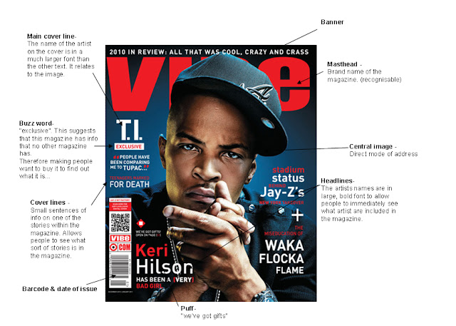
- There is a coverline - 'exclusive interview'. The word exclusive makes people think that they will read info that you can only find in this magazine. Making people want to buy it!
- The seasonal theme fit with the colour theme.
Weaknesses:
- The background photo is too dark.
- In the main image, the 2 girls arn't using 'direct mode of adress'
- There could be much more information on here, also more coverlines linking to stories withing the magazine.
- The colours are a bit boring, it could be much brighter, you can do this by using more colours.
Friday, 7 January 2011
media coursework G321
Hello! my name is Kate Parratt, i am an AS media student at Sponne School.
I will be creating a music magazine cover, contents page and double page spread.

Subscribe to:
Comments (Atom)


